
Domas Swim School
A logo design for my private swimming lessons I created at the SRH
Logo design
A simple project
While I was studying at the SRH, we were given a simple, 2-day assignment of creating any kind of logo, using pohtoshop or illustrator, while also taking the theory we learned into consideration.
In order to finance my studies, each weekend I would give private swimming lessons to children and adults. I though I'd use this time to create a logo for my own swim school in case I ever have one in the future.

A simple project

While I was studying at the SRH, we were given a simple, 2-day assignment of creating any kind of logo, using pohtoshop or illustrator, while also taking the theory we learned into consideration.
In order to finance my studies, each weekend I would give private swimming lessons to children and adults. I though I'd use this time to create a logo for my own swim school in case I ever have one in the future.
Starting considerations
An simple, clear, minimalistic icon
Most swimming clubs have logos with so many detailsm, that if you view them slightly further away, they tend to blend together and blur out. I tried visualizing lining up a few swimming logos side by side, and decided thay my logo would stand out my having less elements alltogether.
Water, dynamic, natural forms
Let's also include a wave, because what else screems 'swimming' louder?
Adaptability
Keep in mind at this time I was still only doing private lessons. I would only practise with one person at a time to 10x the learning rate. Each client has different skills, flexibility, weaknesses. My job is to identify them and adjust the training accordingly.
Trust and safety
Most of my students were kids. I wanted the logo to communicate the idea of me carefully holding a child in the water.
The first draft
A fairly simple idea. The letter "D" represents me in the water, seamlessly adapting to the wave.
I later realized this is likely to be interpreted as a boat crashing down a waterfall. Talk about balance 😀.

The first draft

A fairly simple idea. The letter "D" represents me in the water, seamlessly adapting to the wave.
I later realized this is likely to be interpreted as a boat crashing down a waterfall. Talk about balance 😀.
Finding balance
This looks a lot more serene and safe. Perhaps a little too safe, because all I can see now is an anti-virus shield.
My deliberation here was whether to keep adjusting the few existing elements to create a different perception or add a new element.

Finding balance

This looks a lot more serene and safe. Perhaps a little too safe, because all I can see now is an anti-virus shield.
My deliberation here was whether to keep adjusting the few existing elements to create a different perception or add a new element.
The missing piece
I managed to some degree solve the previous problem by looking a step ahead. Adding a human-like figure was an attemt to 1. convey the message that I do private lessons with a single person at a time and 2. create a sense of security, as if the outer edges of the boat protect the human figure from the water, which would in this case be me.
I was faily happy with this idea, but I wanted to somehow make it proportional.

The missing piece

I managed to some degree solve the previous problem by looking a step ahead. Adding a human-like figure was an attemt to 1. convey the message that I do private lessons with a single person at a time and 2. create a sense of security, as if the outer edges of the boat protect the human figure from the water, which would in this case be me.
I was faily happy with this idea, but I wanted to somehow make it proportional.
An experiment
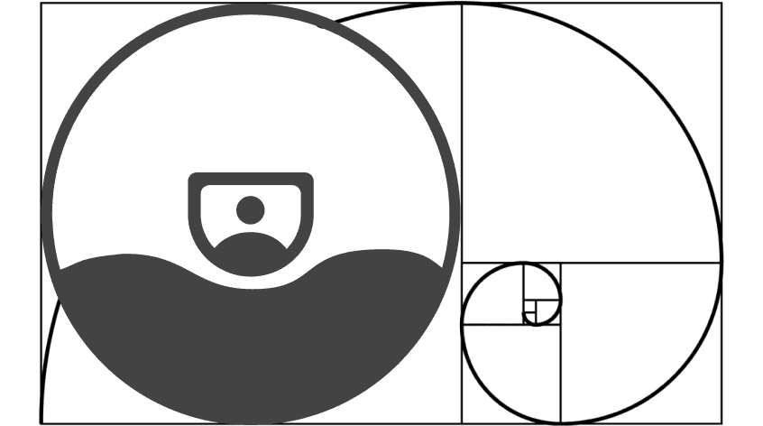
Earlier that week, before being assigned this exercise, I was introduced to the golden ratio for the first time, and I found it truly mind-blowing.
I decided to design this logo as proportionally perfect as I could, following the golden ratio.
An experiment

Earlier that week, before being assigned this exercise, I was introduced to the golden ratio for the first time, and I found it truly mind-blowing.
I decided to design this logo as proportionally perfect as I could, following the golden ratio.
The circles
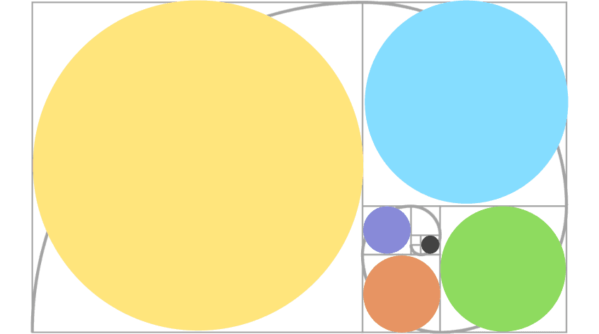
Here we see the proportionally sized circles I will be implementing.
The circles

Here we see the proportionally sized circles I will be implementing.
Building the shapes
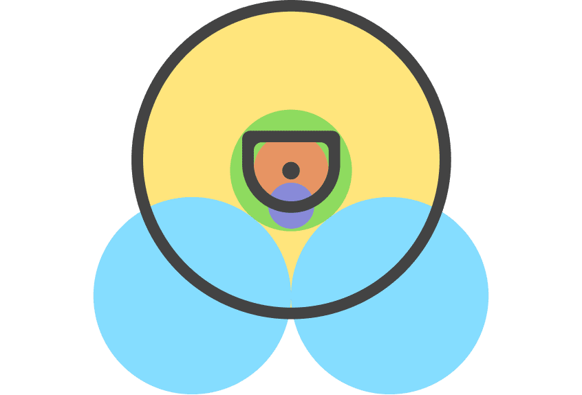
After playing around for a while I managed to position the circles in a way where they serve as outlines for the shapes of the logo.

Building the shapes

After playing around for a while I managed to position the circles in a way where they serve as outlines for the shapes of the logo.
Creating the shapes
I adjusted the thicknes both of the board/letter D, as well as the outlined circle.
Creating the shapes

I adjusted the thicknes both of the board/letter D, as well as the outlined circle.
Abstracting
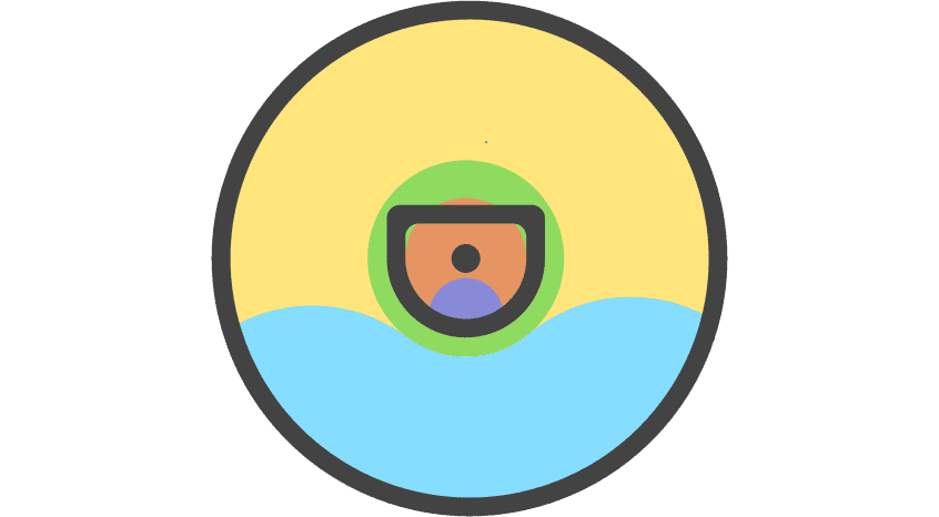
A simplified version of the previous step.
Abstracting

A simplified version of the previous step.
Final version
Tadaaa... we now have a simple and very sexy icon.
Let's round out those corners of the boat and add some color.

Final version

Tadaaa... we now have a simple and very sexy icon.
Let's round out those corners of the boat and add some color.
Final result
Of course I went for blue. I did have to play around a bit with the tone of the color, but eventually settled for a darker, less energetic one.

Final result

Of course I went for blue. I did have to play around a bit with the tone of the color, but eventually settled for a darker, less energetic one.


